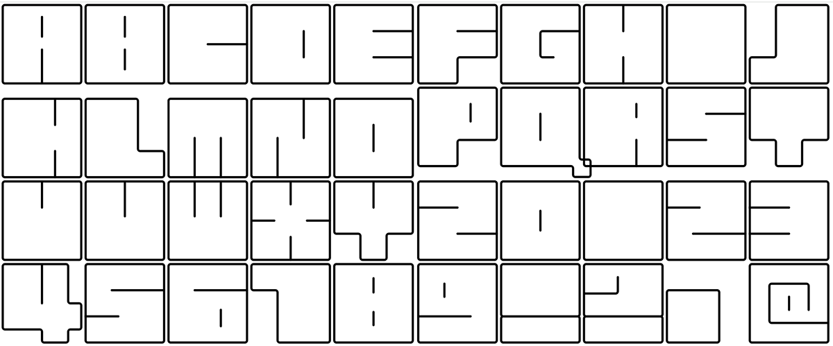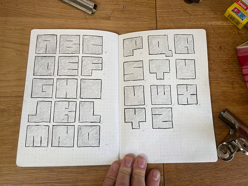
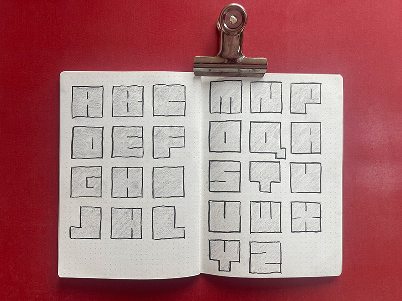
After a day of frustration in the printing studio, where nothing went right, I came up with this alphabet design, while waiting for people to come down to watch a film. Working with a dotted grid, and a restricted box shape, the letters basically formed themselves around some basic rules.
They obviouslyu have a 70s, sci-fi esq quality to them. Plus the standardised spacing of a monospace font.
I'm a fan of the unclear identification of some letters - mainly U and V, but also I and D.
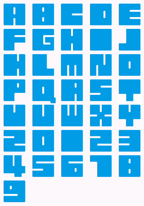
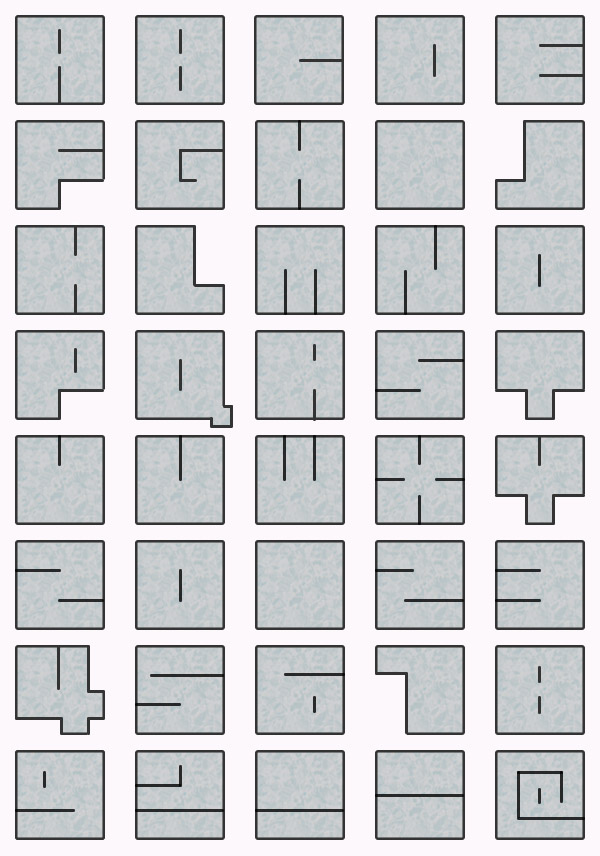
While the sketch quality of pencil and book is obviously appealing, when something like this has such obvious rules to its construct, it seems only right to try to digitialize it.
The first version I tried failed as it basically removed the outline and inner line, and replaced it with a a solid shape with cut-outs. This made it a much gappier font, which lead to much more pronouncement in the letter characteristics.
The second version was more respectful of the original and the rules. And being happy with how it was working, I expanded the set of characters to include numbers and a few punctuation characters.
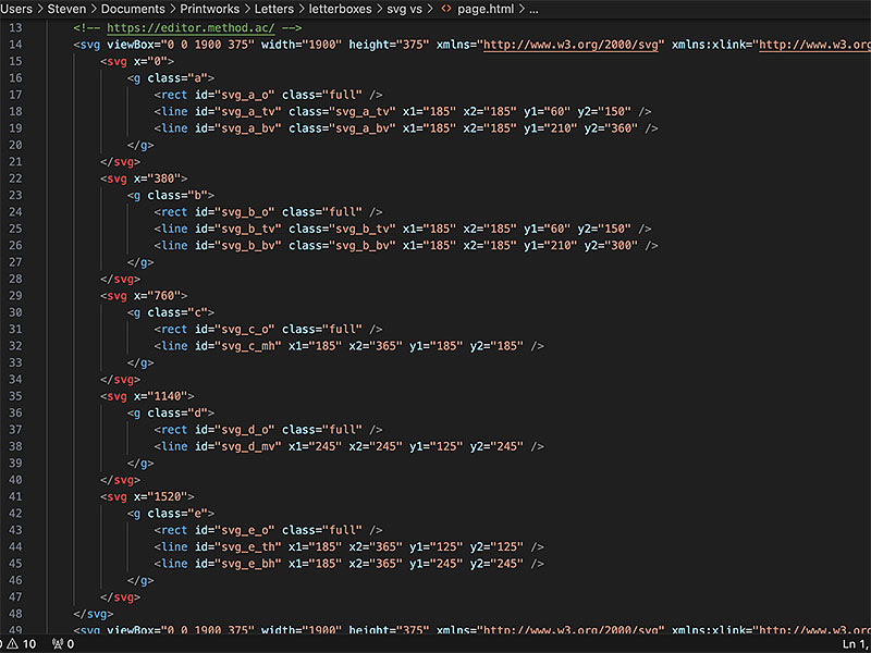
But even more reverential to rules is code — numbers and tags. So I wrote the font out in SVG. This gave a lovely, rule following version of the design, where every corner folowed the same curve and the grid was accurately held to due to MATHS!
An SVG version is also good for creating an animated version... but that is quite time consuming, so haven't progressed super far yet.
