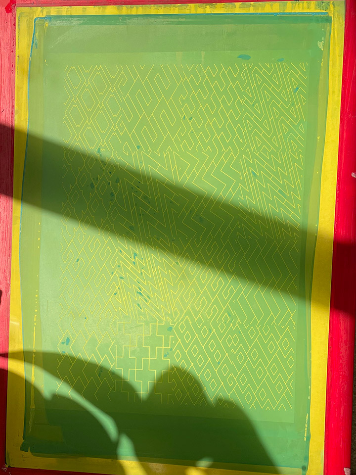
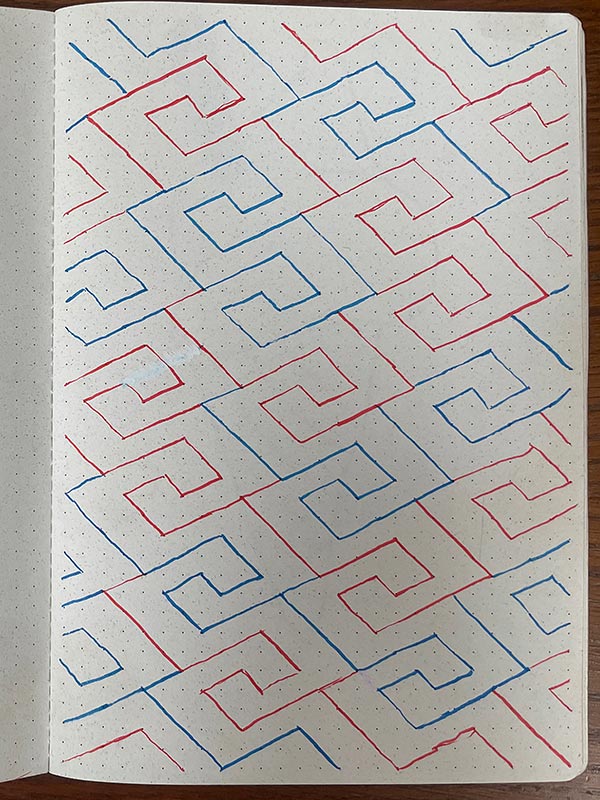
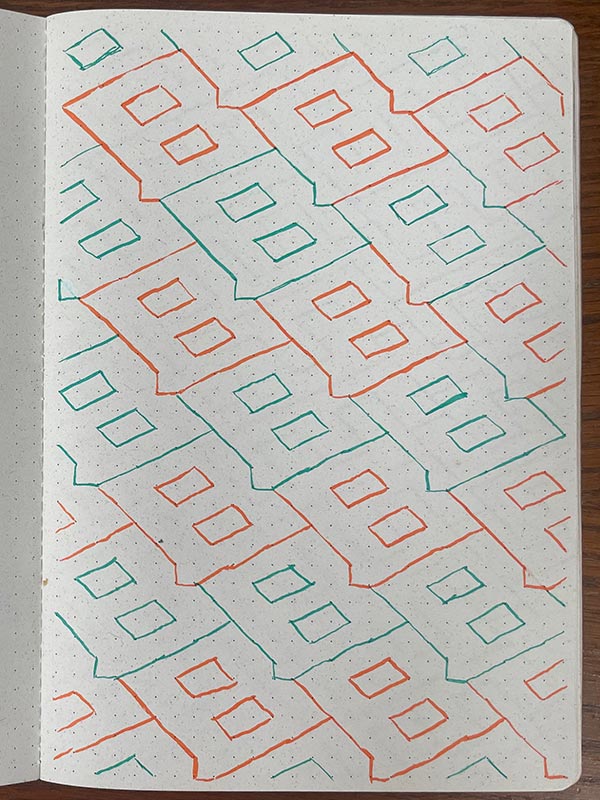
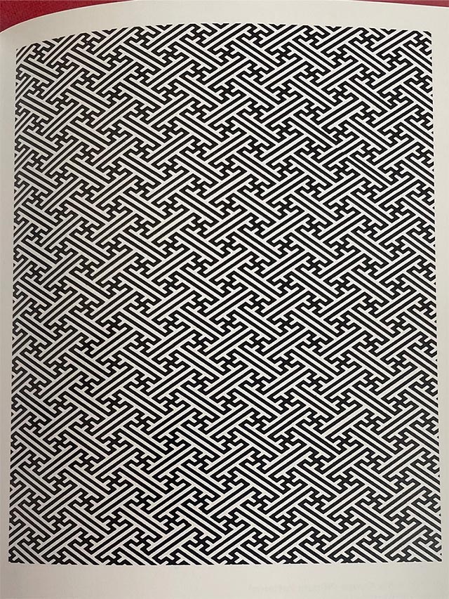
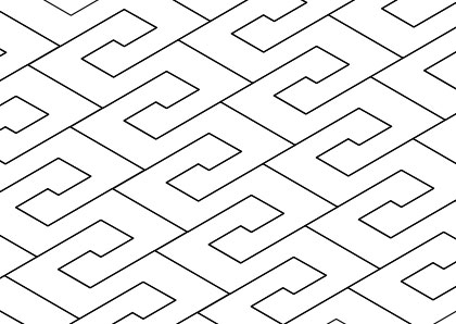
Inspired by this Japanese pattern*, I wanted to create a replicating pattern, using letter shapes of the first letters of my family members. I wanted the shapes to interlock, leaving no spaces. Creating a pattern that delivers a texture and energy, from the lines and corners of the base shape working around itself.
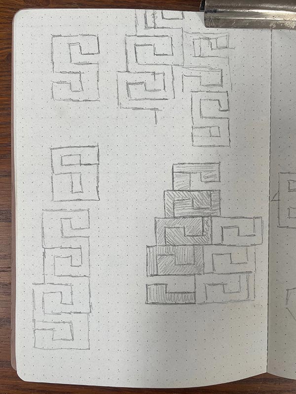
I started drawing the shapes, using a standard grid, but wanting to replicate the angle of the original japanese pattern. Everything became a lot easier, when I used an isometric grid.
* Saya pattern; The Designers Guide to Japanese Patterns - Jeanne Allen
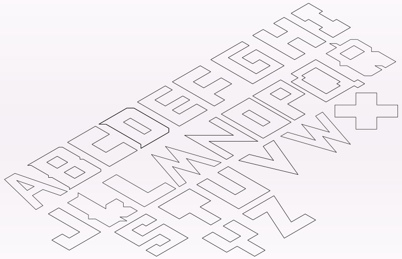
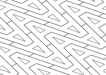
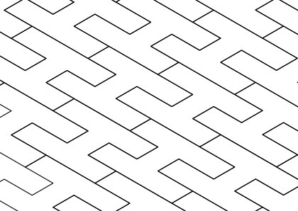
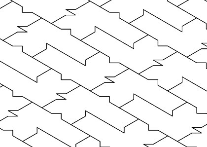
Different letters obviously had different challenges, when creating an interlocking shape with no gap. 'R' and 'K' proving particularly tricky. in some of these instances I have to invent additional parts of the letter form, in order to have a protrution to fit into a void. Some letters definitely have a more elaborate, 'created' look to them, than others.
Seen altogether but not in pattern form, the letters do not look like a font, or atleast, not a usable one. They have a feel of the OCR-A or -B font, one created for specific computer usage.
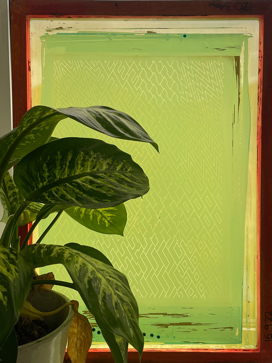
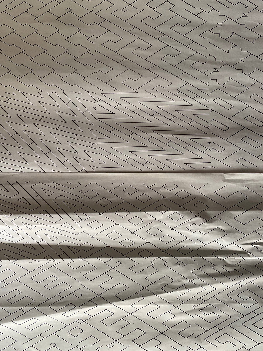
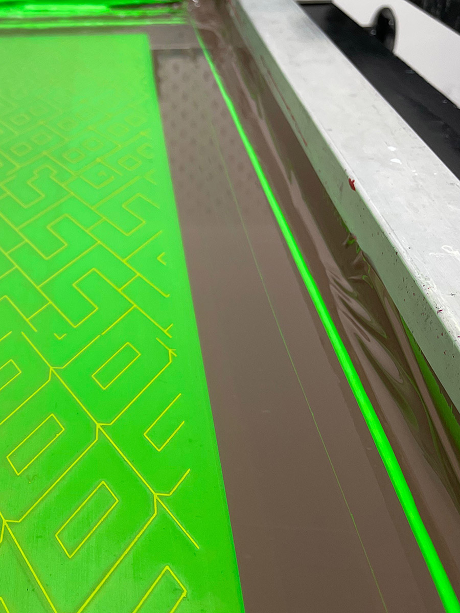
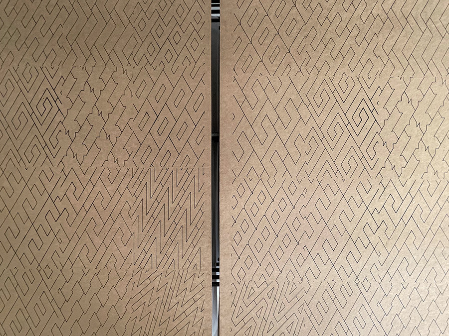
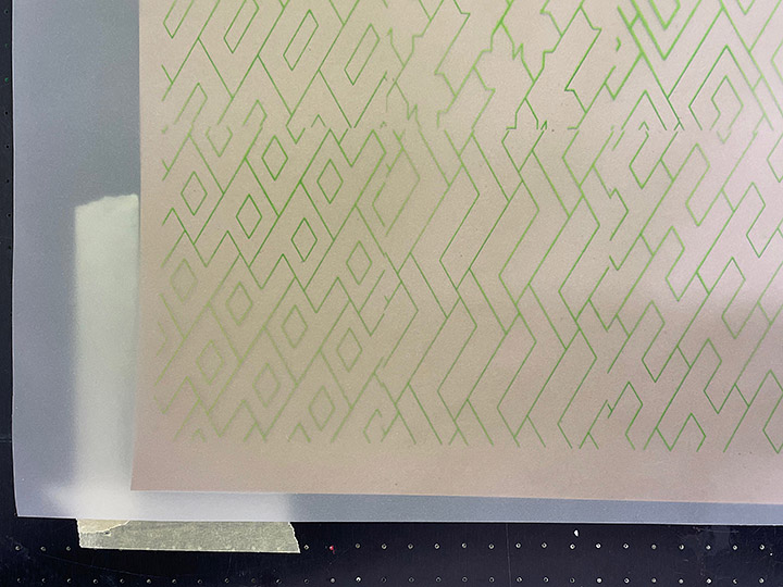
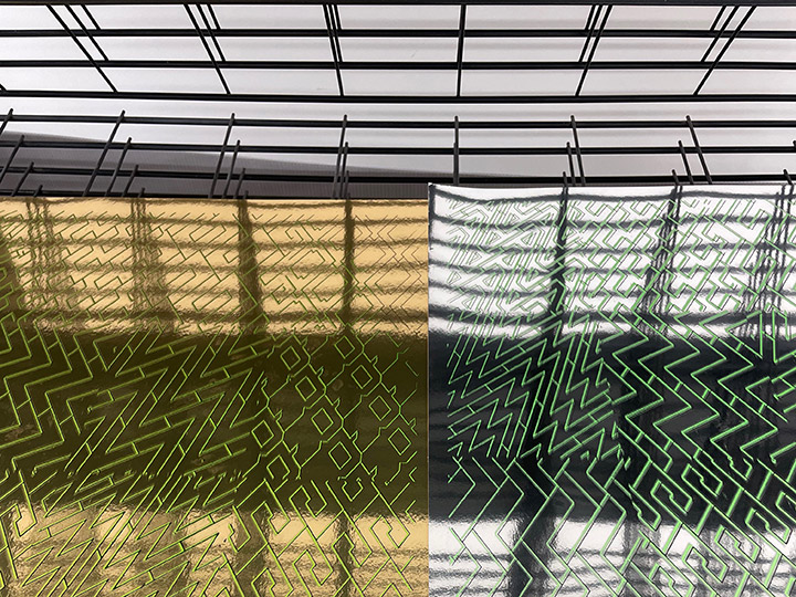
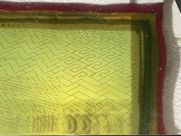
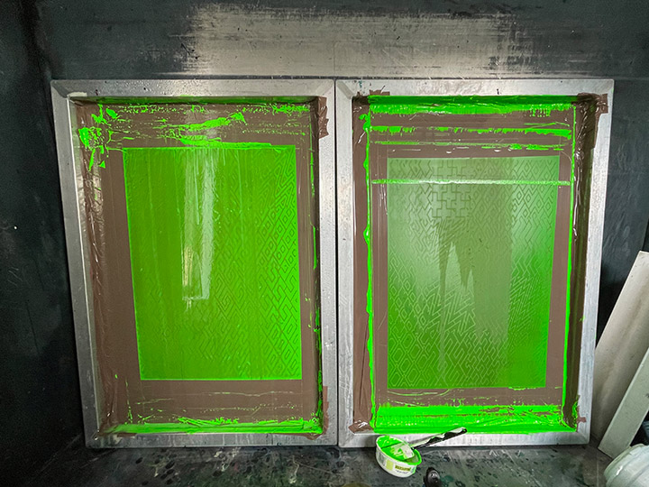
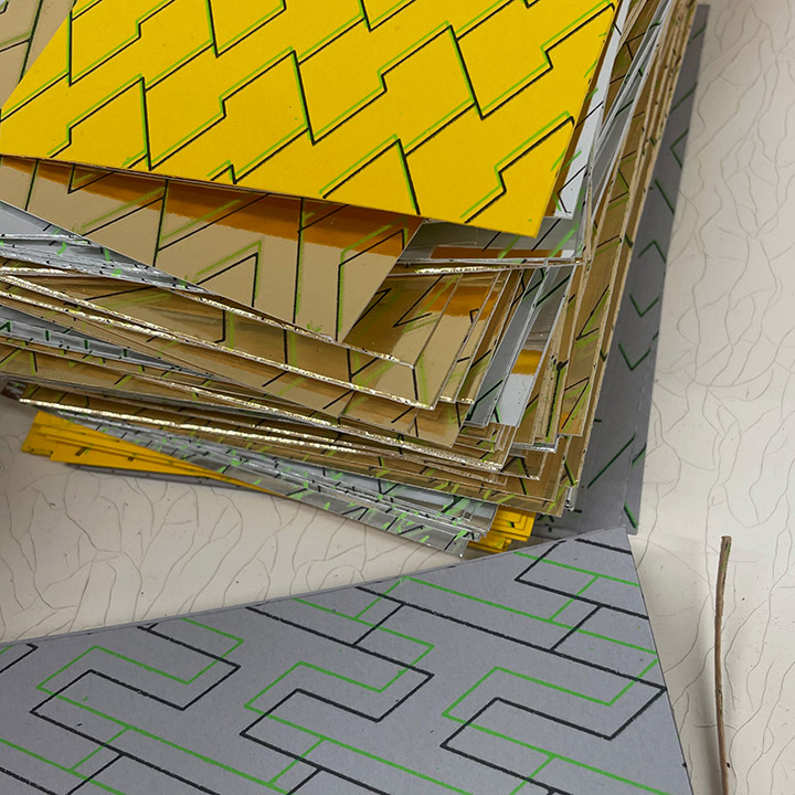
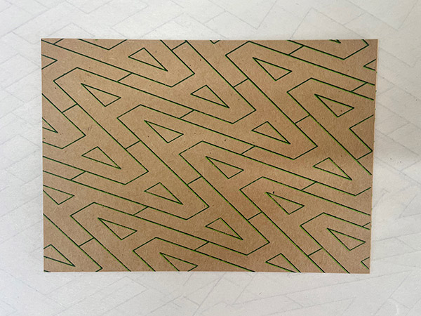
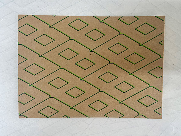
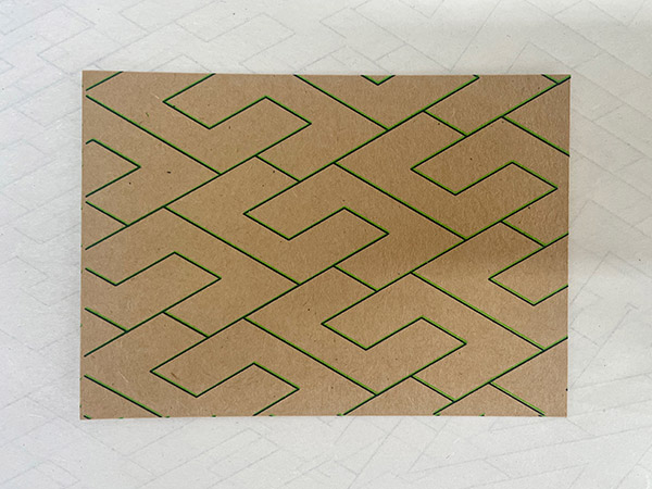
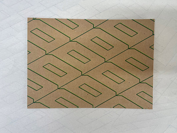
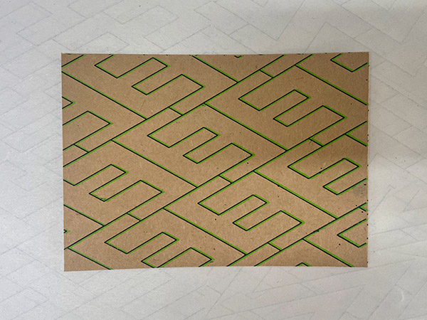
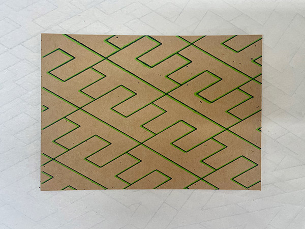
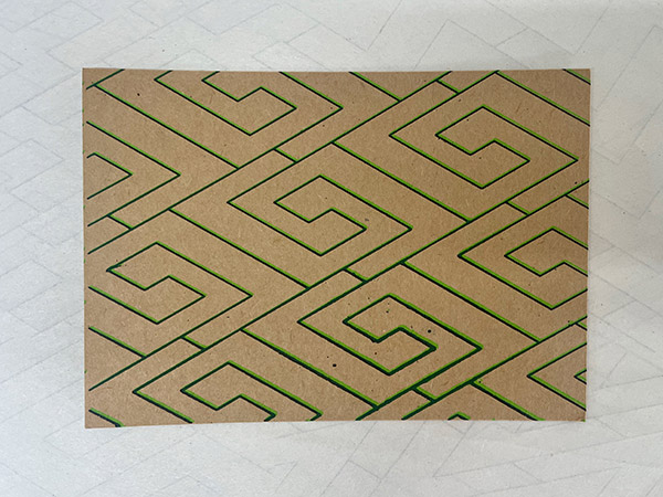
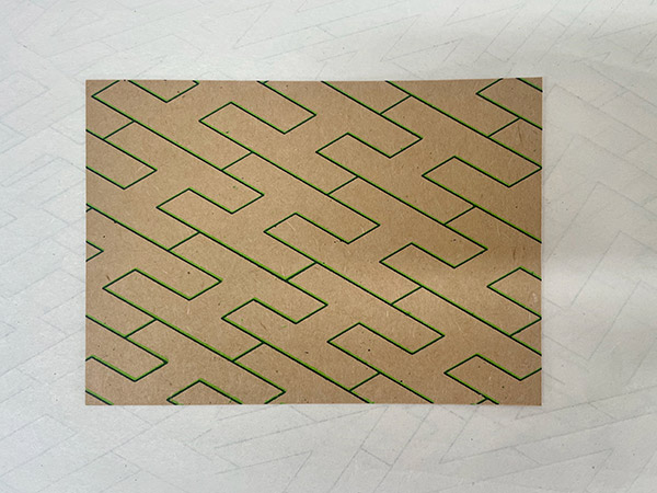
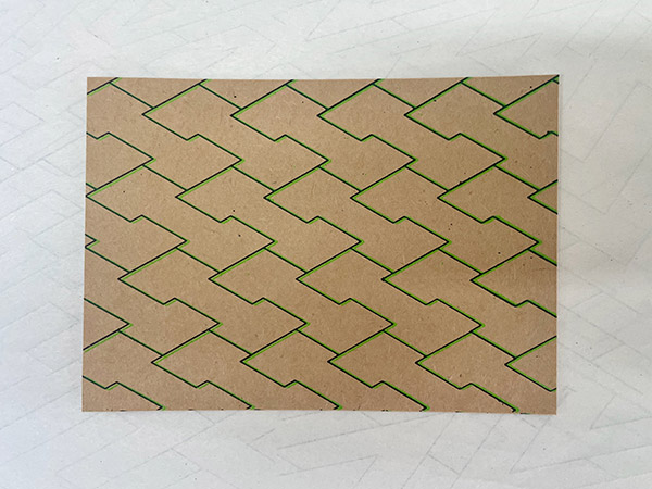
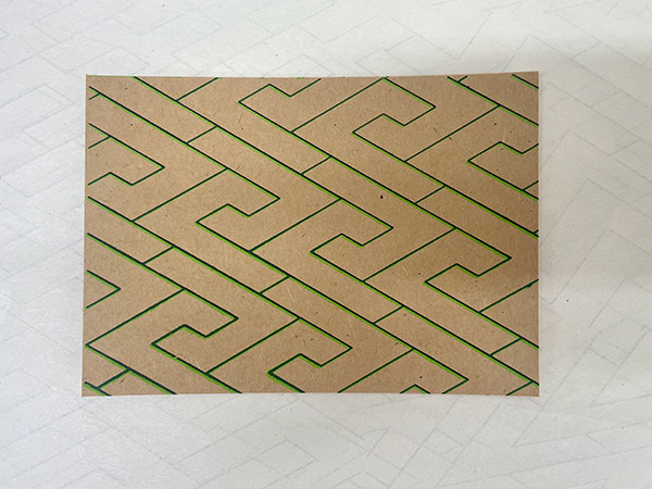
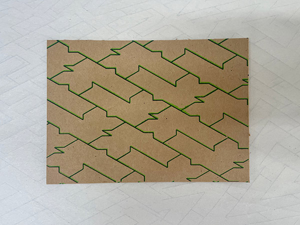
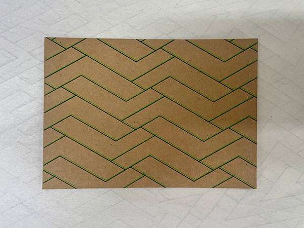
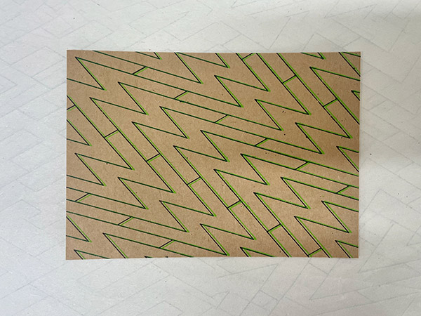
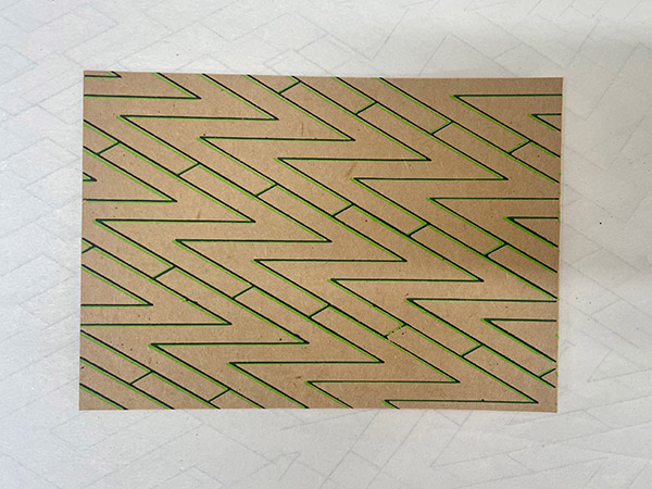
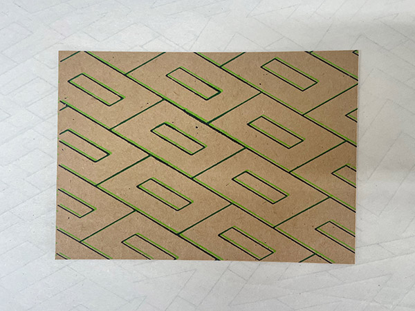
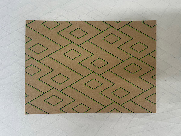
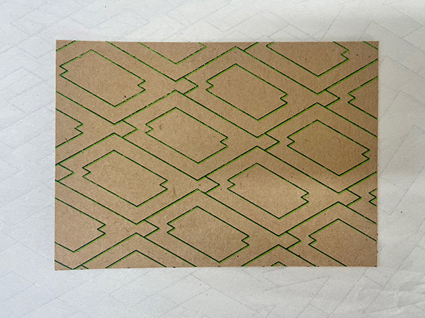
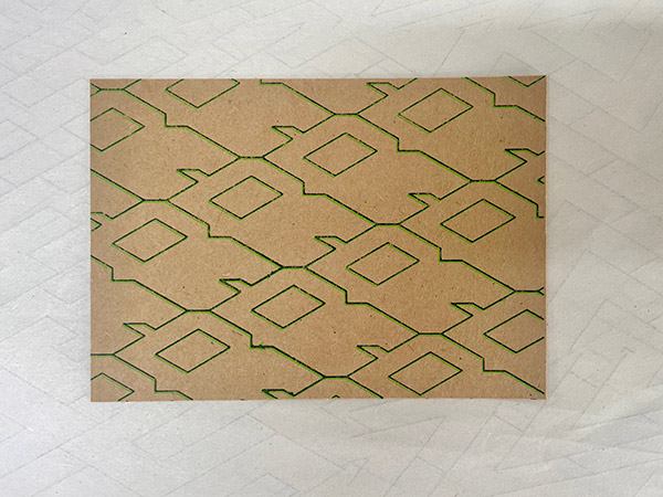
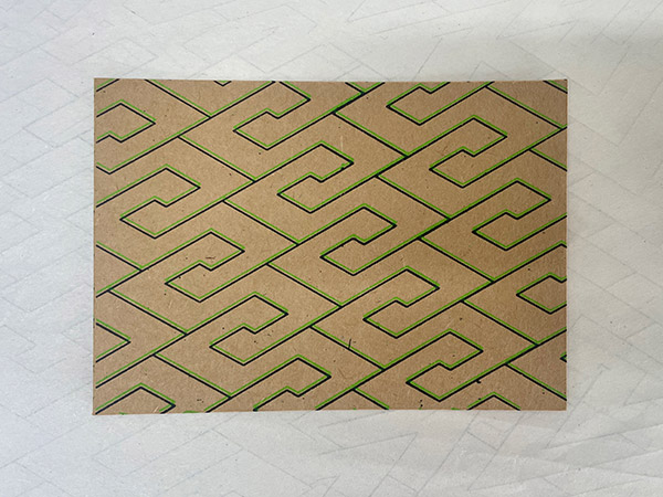
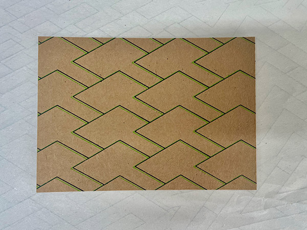
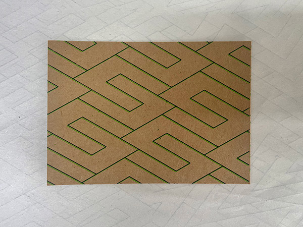
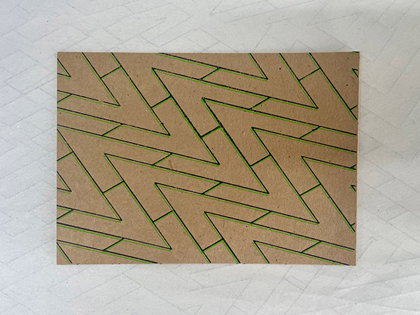
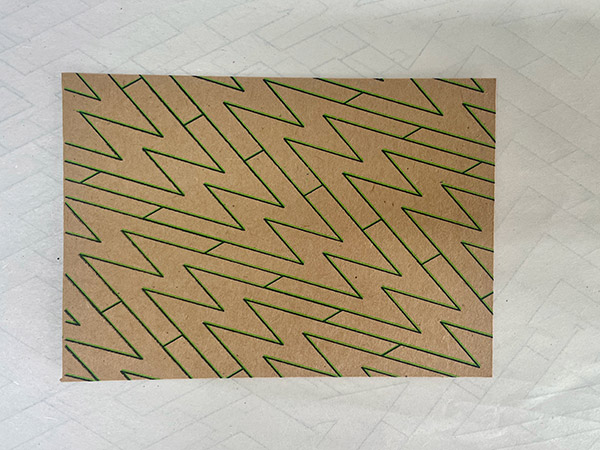
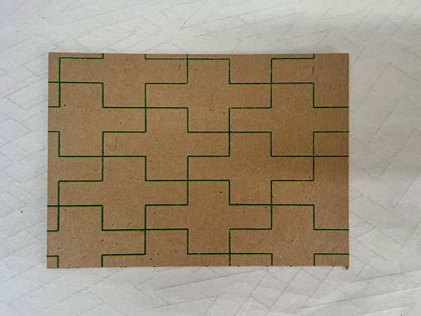
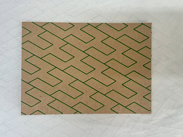
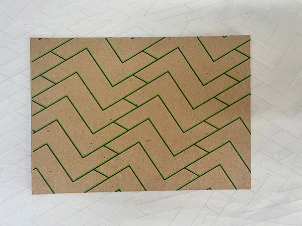
While each letter brings a different energy, I feel there is no winner here. The simpler letters — eg. 'Z', 'L', 'J' — create more relaxed, wavey patterns. While letters with many corners or protrusions — eg. 'G', 'K', 'S' — give us a more ornamental look, more decorative.
I like to think that you can love whatever pattern your initial gives you, in much the same was that we can love our name, for our own justifications.